
Regnology - brand refresh
Brand refresh for Regnology while Head of Creative Design, as part of their in-house Marketing team.
Brand Identity. Web Design. Visual Language. Social Media. Creative Direction.

From a few ingredients to a full recipe
The FinTech firm Regnolgy had gone through a renaming and rebranding process in 2021. The end result was a small set of brand elements designed to be a starting point for a broader branding exercise.
To make the business effective and recognisable across a variety of mediums Regnology needed these “design ingredients” evolve into a modular and replicable design framework, able to perform regardless of what we wanted to create.
The starting point
The original design elements were conceptually sound but did not give enough guidance on how to create further assets and were mostly geared towards print. What was available was: Logo, colours, some icons, some design elements derived from a pixel grid system, and a custom typeface.
Little direction was given on how these elements were to interact and perform in real life scenarios. This is when I came in.

The original design elements arranged in a poster set-up. Contrast and readability issues were widespread.
The original icons where good and gave enough direction for developing a full library.

The original colours hade some contrast issues especially when using the green ‘signature colour’ on white, so this had to be addressed from the start.

The secondary colour palette was devised for diagrams and charts but did not help much when applied to other assets.

The original visual identity applied to an ad.
Beyond the limited design direction another core challenge came from how hard it was to work with the given colour palette.
The green accent was only readable when on black or dark grey backgrounds, which is fine when you can fully control your design, but the minute you need let go of that control and apply it to documents and other branded assets (PPT, Word, PDFs, etc.) you soon realise that they are really hard to work with while maintain readability. It was clear from the start that the brand colours were the first thing needing to be addressed.


The original social posts.

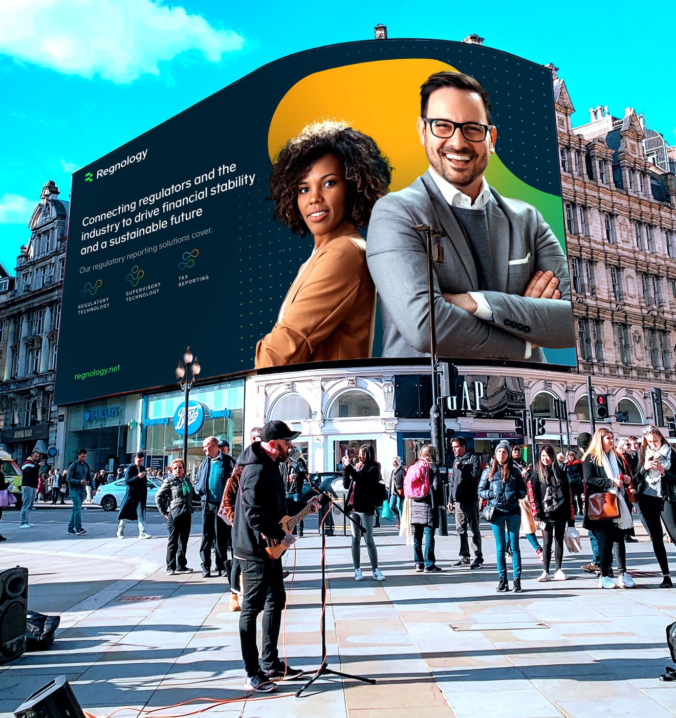
The old homepage showing the contrast and readability issues. Another challenge came from the pixel elements which were visually “noisy” and dominated the layout without adding much value. Photography use-rules also needed to be revised to allow for more people and less buildings and cityscapes.
The evolution

The original logo had some contrast issues (green) and the capitalized text made it hard to read (even harder when the word is a made up name which users have not encountered before).

The revised logo saw a move towards ‘sentence casing’ for ease of readability and custom typeface work to align to the hard corners of the icon. A darker green was introduced for better contrast on light backgrounds.
A negative version was created keeping the original light green for use on dark backgrounds.
The colours were approached from a practical perspective, keeping the original green tone but adding a darker variant for light background scenarios.

A new multi-point gradient was also introduced (derived from the signature and secondary colours) to be used in special cases.
A new secondary palette was introduced for accents and backgrounds, while new support colours came into play for secondary text, background colours and other use cases.


An extensive icon library was created using the initial 12 icons as a starting point.
Creating modularity
Part of my philosophy when doing design exploration and creating new visuals is to see if and how the existing elements can be developed into something new (rather than creating something from scratch).
For this project I wanted an element which was modular, flexible, and adaptable to a variety of design assets. Which could work as a standalone shape, as an abstract background to people, and as a frame for photos. I also wanted this to move away from the preexisting dark and rigid grids.
The winning idea came from the R element of the logo. I took it and let it evolve into a more organic shape, I then used that principle to create multiple elements.
The next step was to define the layout rules of my assets and incorporate them consistently.


A lot of work was put into the Social Media layouts for the corporate Linkedin page as the Marketing team planned to intensify presence and brand awareness through this channel.


Examples of the visual identity applied to brochures and promotional print material.


Slides for the corporate presentation deck.

Single elements for the corporate website.


The website was completely redesigned from the navigation to the user interface. See the full site at Regnology.net